Dev Diary: Design Progression
Simultaneous with our Cursed! Kickstarter campaign, we are doing fairly extensive play testing and refining of the actual product. As we state on the project page, the game is in roughly a beta stage, and we’re really nailing down what it’s going to look like and play like in the final release.
A big part of what we’re refining is the appearance of the game. We have prototypes with an initial design, which made total sense to us, but not so much when it got out into the wild. These are things you can’t learn without prototypes, of course.
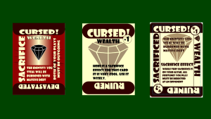
Here you can see the progress we’ve gone through in the past couple of weeks. On the left is the appearance of card “Wealth03” (sexy name, right?) as it appears in our prototypes. The icon for the particular fortune (Wealth) appears front-and-center, underlined by the jokey flavor text. Off to the side, so you can read it when the sacrifice is in effect, is the sacrifice effect. Makes perfect sense, right?
Wrong.
All of our play testers have disliked this design, and commented how much easier it would be if the sacrifice text (which one playtester described as “the important part” and it is) was readable holding the cards in the traditional fashion. One tried holding the cards horizontally, but he couldn’t keep it up, it was just too unnatural.
The middle is my first pass at redesigning the cards, and you can see it hasn’t even had the real text put in, as it was pretty quickly further refined to the version on the right, which is where we currently stand.
Some further changes included making the game element of the Cursed vs Devastated distinction more obvious with the -1/-2 bubbles. We also renamed “Devastated” to the more eloquent “Ruined,” and now you can ruin people in this game. And you should.
Finally, the coloring got a lot subtler, and all the cards are essentially single-color now — that color being determined by the power of the card itself (Curse, Bless, Neutralize). I think it’s more elegant-looking and goes with the new backs, which are similarly understated.
Which design do you prefer? Let us know in the comments or on Twitter @strangelandgame.


Thursday, April 24th 2014 at 10:21 pm |
They definitely need some color. They just looked so bland. I don’t really care for the circles with the -1/-2 in them. Kinda distracts from the design. I liked the sacrificed text on the side but I guess I’m in the minority. I also have a hard time reading the text that is printed right on top of the diamond. I also liked it better with the Wealth text printed across the top of the card and not as much on the side.
Wednesday, April 30th 2014 at 8:43 am |
After seeing the final design, I realize I just don’t like it. It’s growing on me in a bad way. Most likely I’ll be canceling my order.